UX/UI | STUDIOBEE.CO.IN
case study
Designing a brand-forward agency website that gives a feel of luxury, is trustworthy - and looks like the best agency in the room.
Role
Lead UX/UI Designer
Year
2026
Deliverables
Brand system · UI design · Prototype
Overview
"The brief was simple: make it feel like the best agency in the room."
Project Brief - Studiobee, 2025Audience
Indian founders
& marketing leads
Mobile-first visitors comparing agencies, making decisions within 8 seconds on a commute.
Goals
Premium positioning
through restraint
Showcase work front-and-center. Signal quality through typography and motion - not decoration.
Design Constraints
Hard limits shaped
every decision
Mobile-first touch targets · Brand must feel premium, not templated · Work must be front-and-center
Design Process
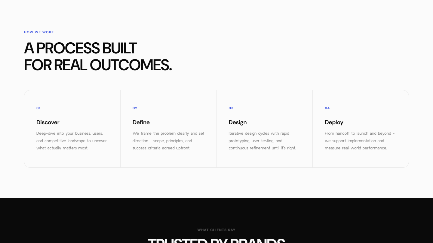
Discover
Research
Define
Brand + IA
Design
Wireframes
Prototype
Build + Test
Iterate
Refine + Ship
Colour Tokens - Primary
Colour Tokens - Secondary
Typography System
Headlines.
Kulim Park · Headings
Large headings, section titles, card headers, set in Kulim Park - a display serif with tight negative tracking at -0.04em for confidence and precision. Body copy, buttons, and form fields sit in DM Sans.
User Research
Competitive Landscape
Ragged Edge
London Agency
Black bg, white display type, motion forward. Signals: serious craft, no compromise.
Superside
Global Scale-Up
White bg, large photography, case study heavy. Signals: scalable, trustworthy, process driven.
Koto
Brand Studio
White/cream bg, editorial hierarchy, work gallery. Signals: considered, expensive, taste.
Primary Personas

Rahul M.
Co-founder & Marketing Lead
Compares 3 agencies on his phone during the evening commute. Decides in 8 seconds.
Values: proof of work, fast replies, local market fit

Priya D.
Startup Founder
Reviews agency portfolios on a laptop the night before pitching investors.
Values: case study depth, pricing clarity, credibility
Vikram S.
Freelance Growth Consultant
Bookmarks agency sites between client calls to recommend to founders later.
Values: fast load time, clear scope, easy contact path
Research → Design Decision
Insight
Mobile-first visits, short windows of attention
Decision
Hero animation simplified below 390px
Insight
Work is the #1 decision factor, not the About page
Decision
Work surfaces at section 03, before Services
Insight
Dark, restrained visuals read as premium
Decision
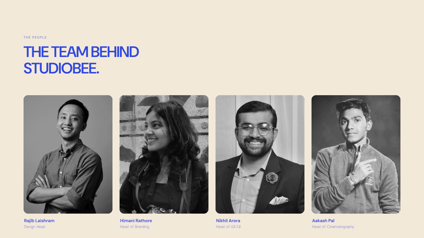
Black bg + blue CTA; cream reserved for Team
IA & Conversion Architecture
Every section position is a deliberate conversion decision - Hero to proof of work to CTA in 3 scroll stops.
Fixed Nav - always visible - then, in scroll order:
Proof before pitch
Work is section 3 - visitors judge quality before reading the pitch.
Text links navigate, buttons act
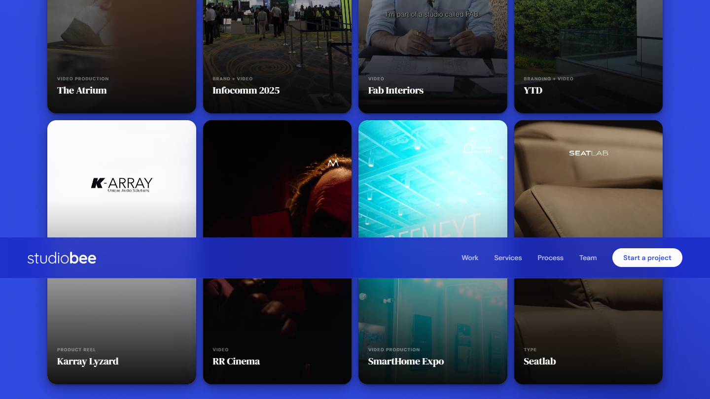
Only "Start a project" is a button - everything else is a plain link.
Show more, ask for nothing
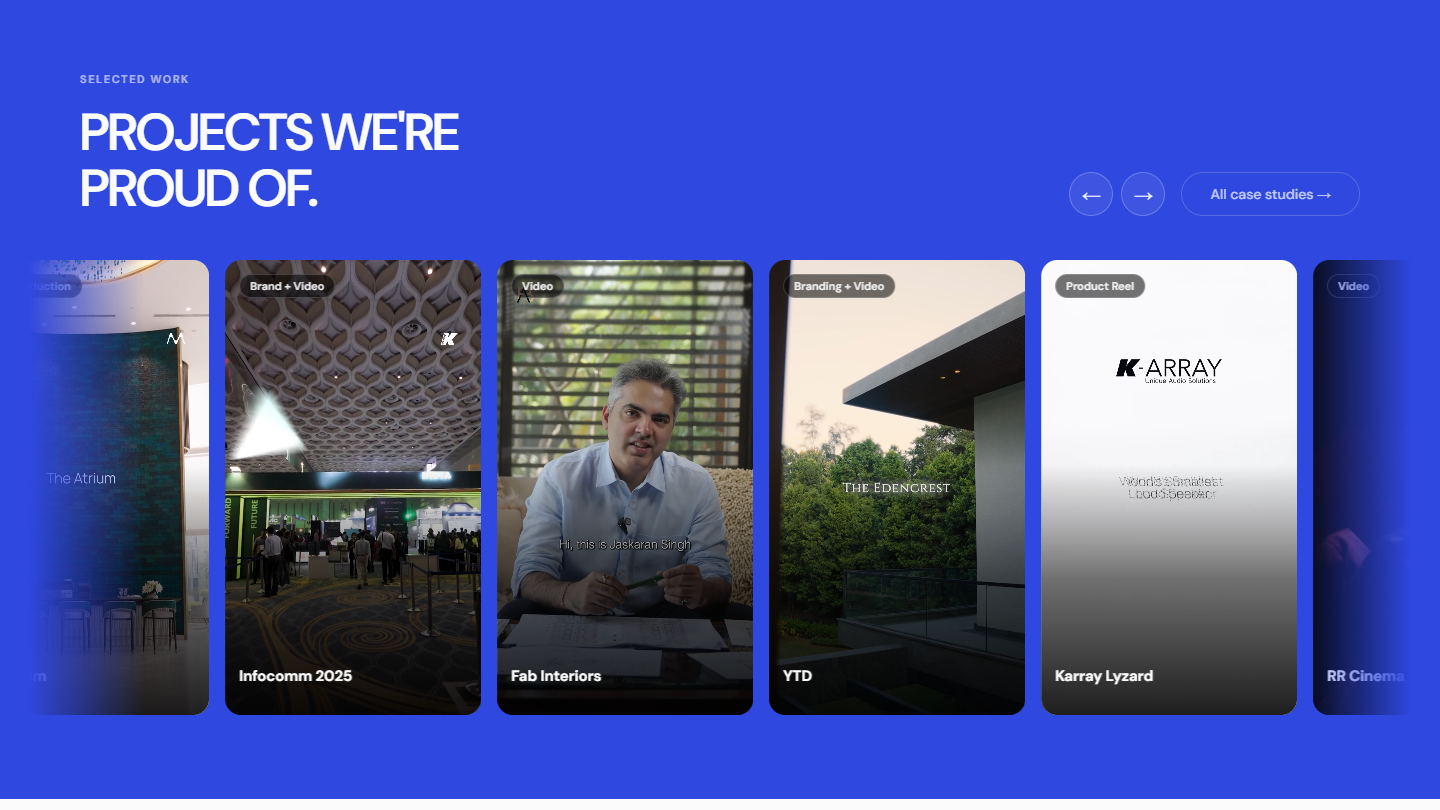
Auto-scroll marquee, 9:16 cards - the ratio this audience already scrolls.
Hero → Work → Contact
3 scroll stops to conversion. Services and Process just support credibility.
Final UI - Desktop
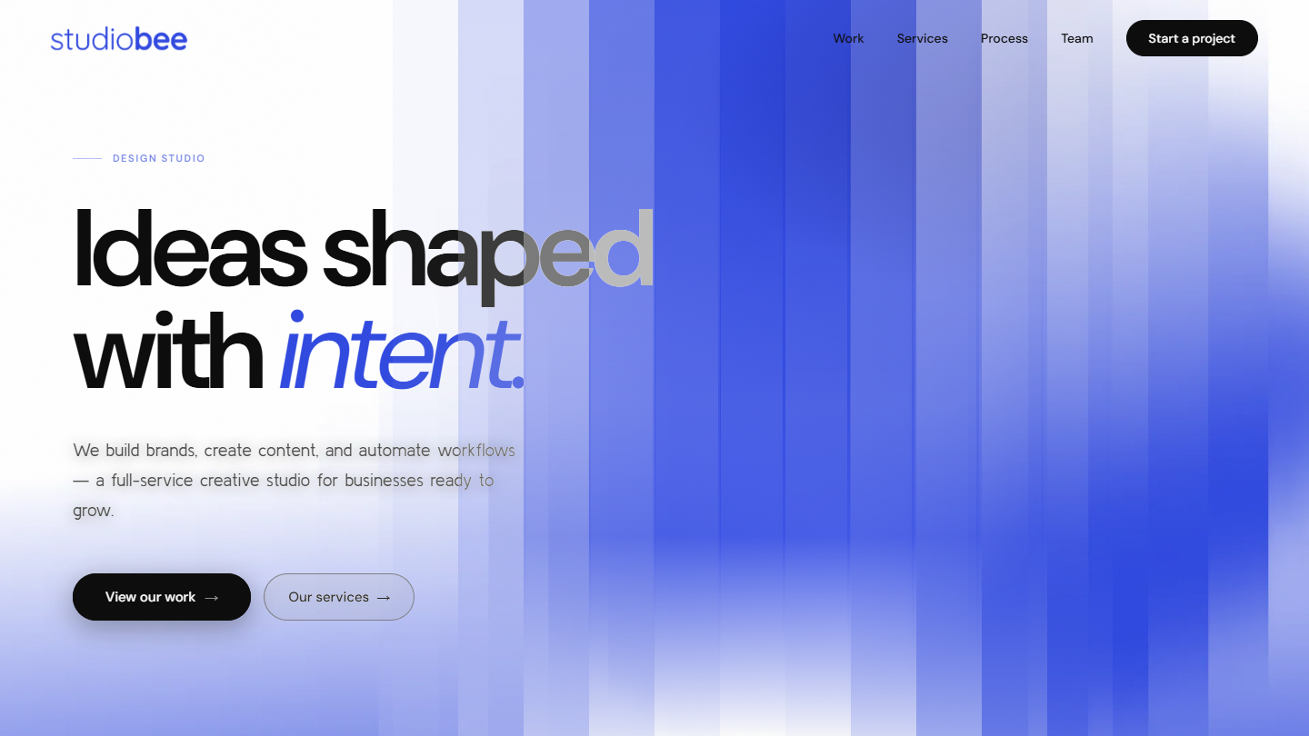
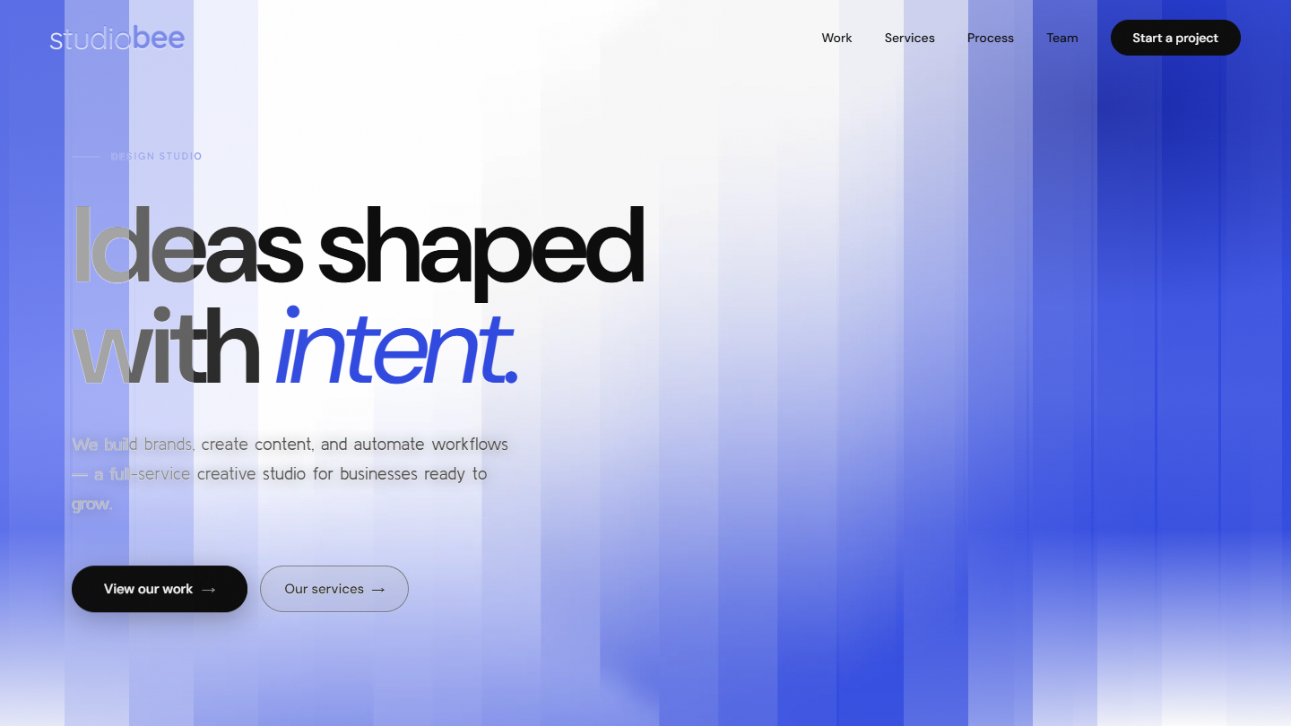
Hero
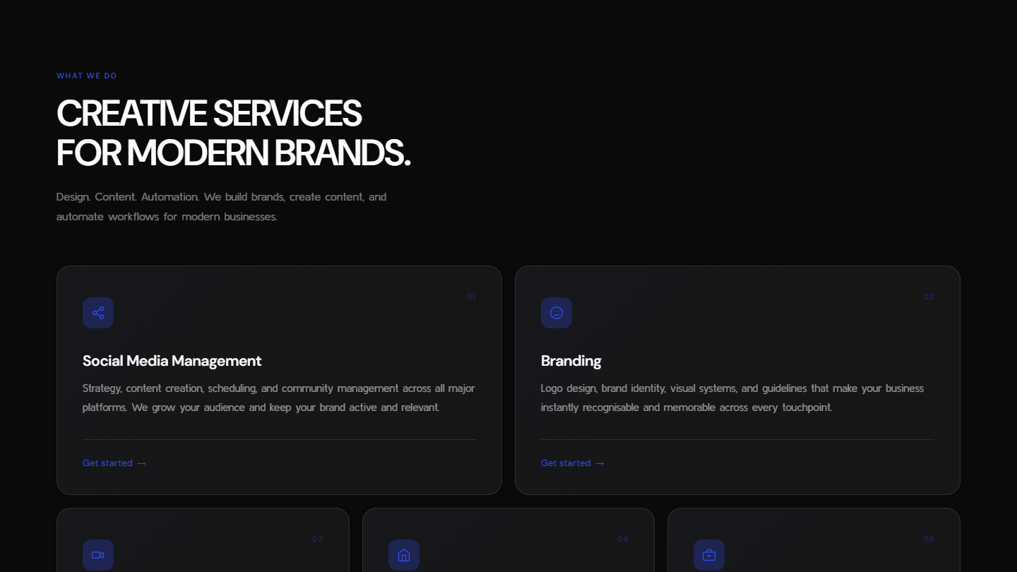
Services
Work
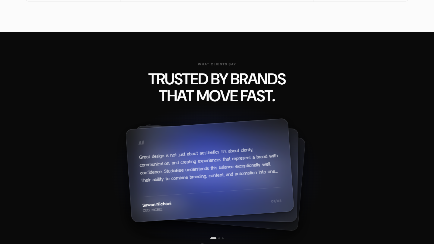
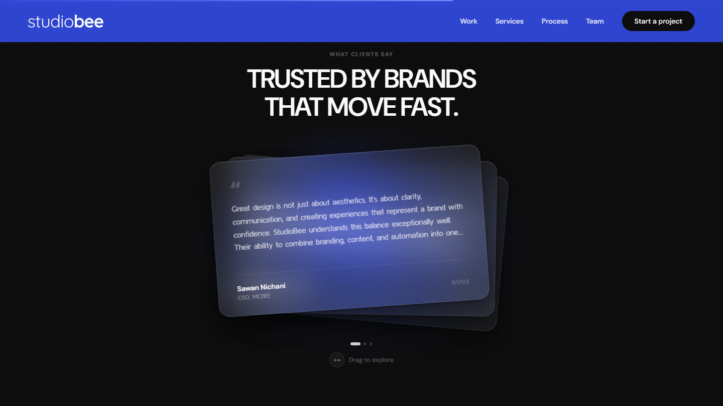
Testimonials
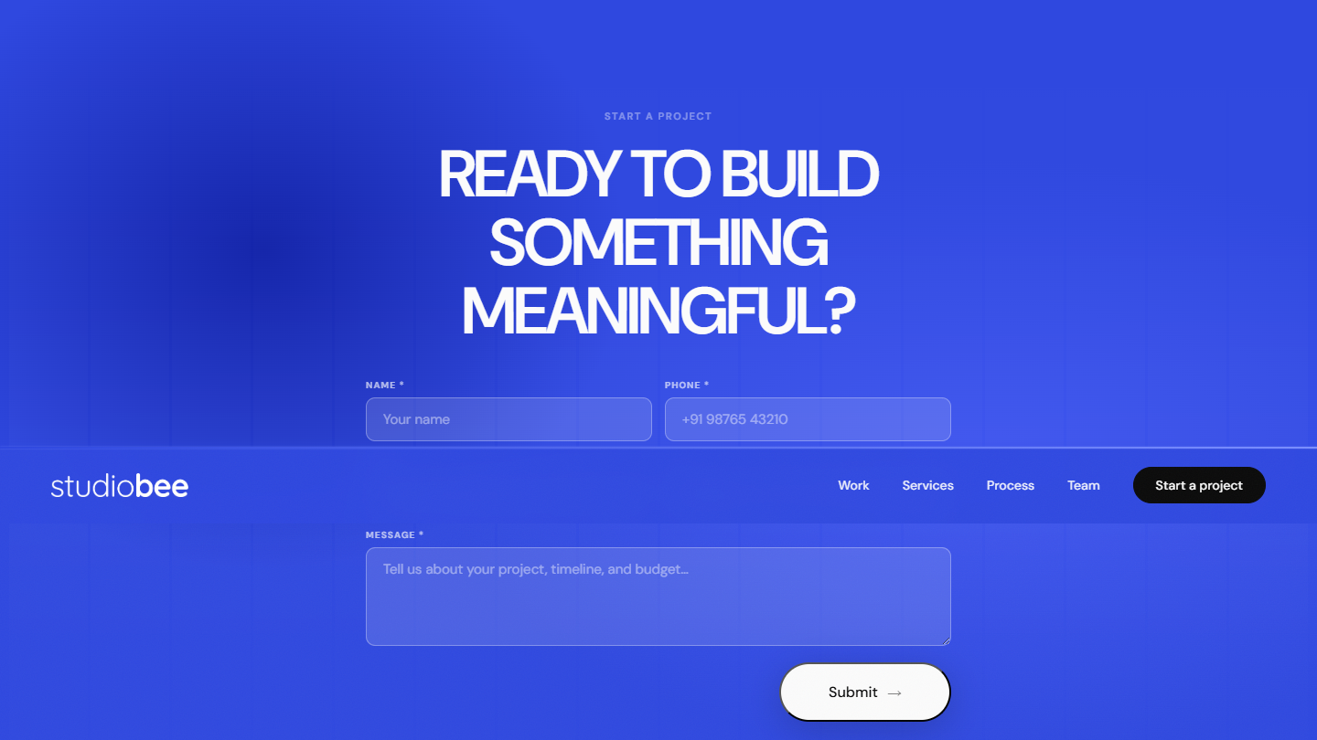
CTA / Contact
Final UI - Mobile
Hero
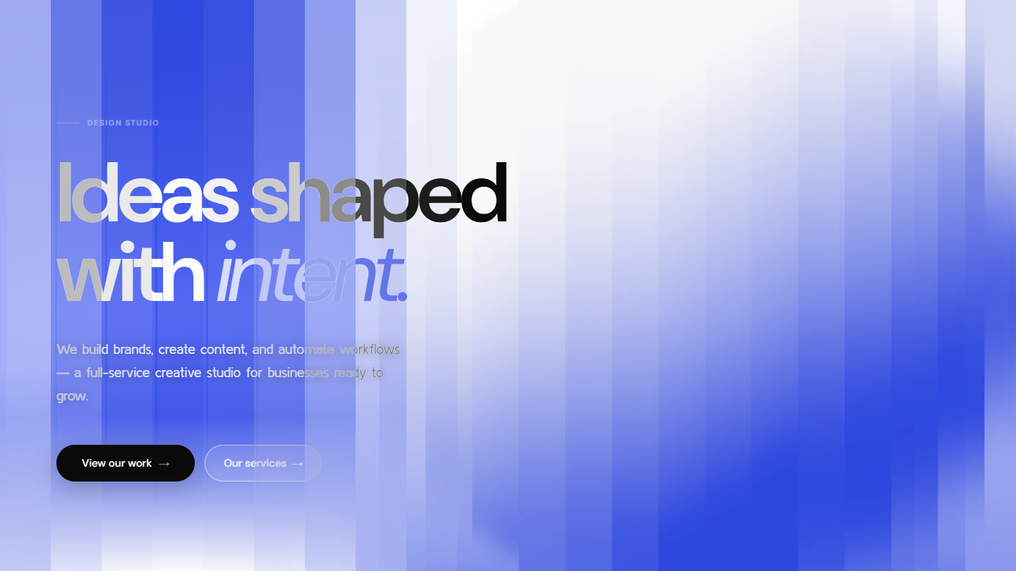
20-strip wave · text scramble
Services
Dark bg · blue-top cards
→ → → auto-scroll
Work
9:16 portrait cards · marquee scroll
drag to reveal →
Testimonials
Glass morphism stack · draggable
animated success state
CTA / Contact
Blue full-section · success animation
Design for Constraints
The earliest hero leaned hard into the wave reveal and ended up overcrowded - too many moving parts competing for attention in the first three seconds. We audited every motion and asked: does this earn its place?
Animation Audit
The early hero crowded the wave reveal with too many moving parts in the first three seconds. We treated animation like typography: only what communicates energy earns its place. What's left is a single, confident gesture instead of a dozen small distractions.
Testimonials
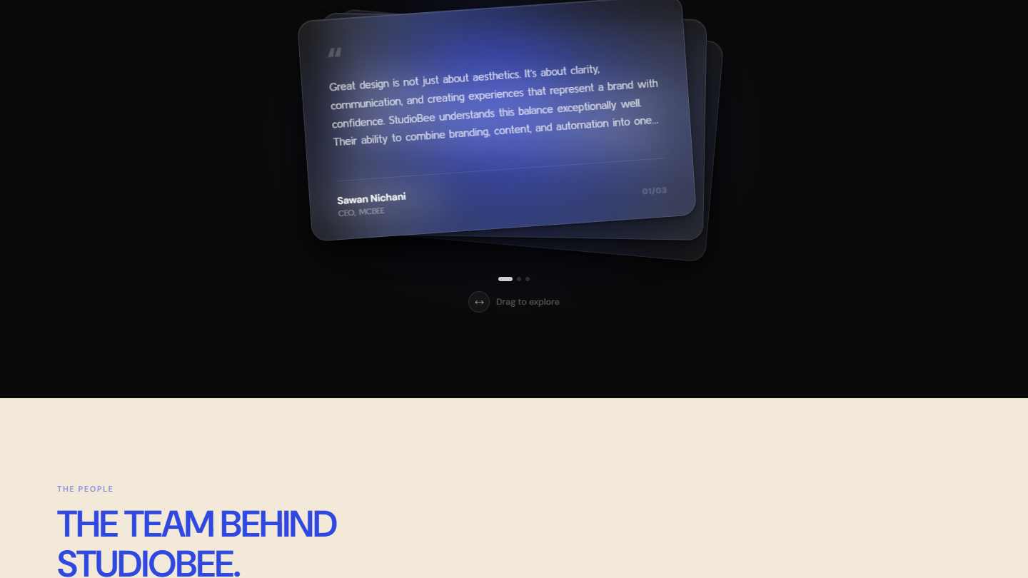
The testimonials section went through three layout passes. A light split-screen felt too corporate for a creative studio. A cream card stack looked warm but visually flat next to the rest of the site. The dark, frosted-glass carousel finally gave it the full-bleed, tactile impact the brand needed.
Testimonials Iterations
Light split, cream stack, dark glass. The first two were dropped on feel, not function - one read too corporate, the other too flat. The frosted-glass version was worth carrying through to the final design.
Case Studies Layout
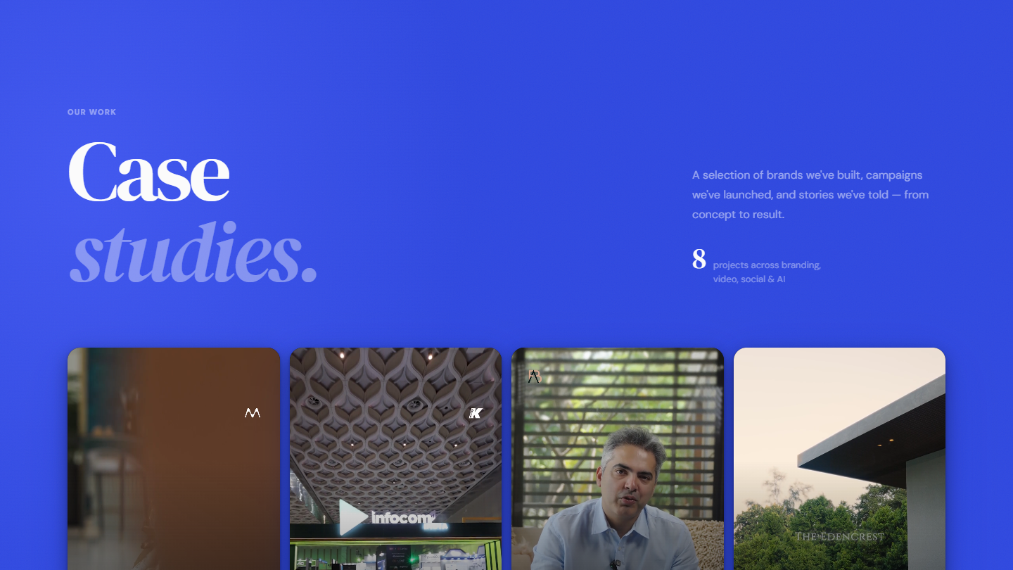
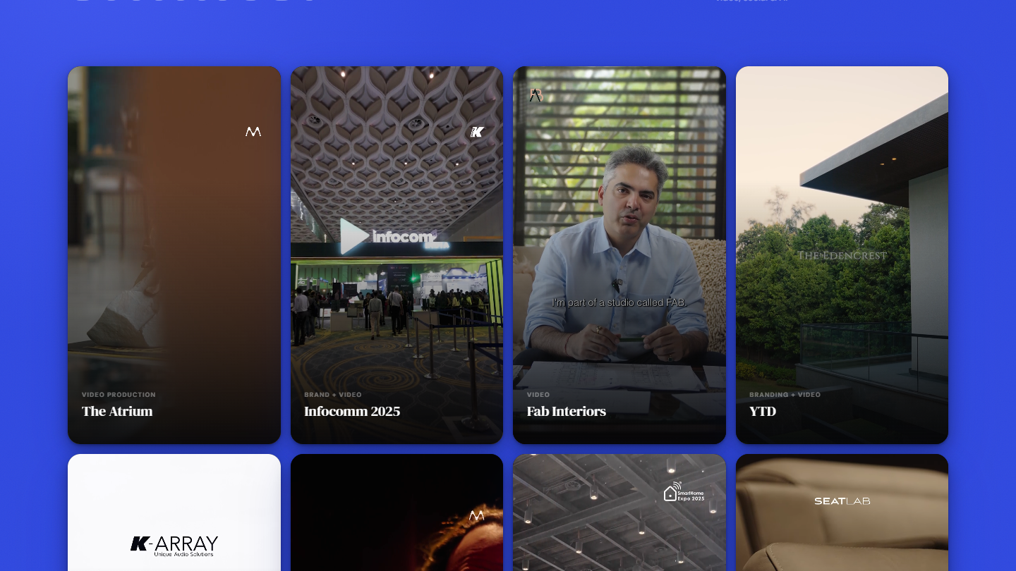
An irregular masonry layout competed with the video thumbnails - every card wanted to be the focal point. A uniform 4-column grid with consistent proportions let the work lead. Eight projects, mixed formats, one structure.
Grid Decision
Masonry gave each project breathing room but fractured the visual rhythm. A uniform 4-column grid imposed the consistency the content lacked - the constraint of eight diverse projects produced the most disciplined layout on the site.
Ghost Button
Early versions animated the whole ghost button on hover, which felt heavy against the rest of the site's restraint. Now only the arrow moves - a nudge, not a shape flying across the screen.
Outcomes
Premium Positioning
Reads like a top-tier agency
Restraint, tight type, and purposeful motion consistently draw comparisons to international studios - from a client base rooted firmly in the Indian market.
Conversion-Led Structure
Work is the second thing you see
Putting the work before the pitch was a hypothesis going in. It held up: work is still doing the heaviest lifting in earning trust.
What Worked
Wave strip brand signature · 9:16 portrait cards · arrow-only ghost button · greyscale team hover
What I'd Revisit
A small component library before the design system grew this large · case studies fought harder into the primary nav