UX/UI | BEENEXT.CO.IN
case study
BEENEXT is India's Value Added Distributor for premium AV, IT & automation brands. The goal: make it feel like the most credible, premium distribution partner in India, in the first few seconds on the site.
Role
Lead UX/UI Designer
Year
2026
Deliverables
User research · Brand system · UI design · Prototype · Content management panel
Overview
"We needed a website that felt like a premium partner walking into the room, not a product catalogue. Every Custom Integrator visiting should immediately understand this is the best distribution network in India."
Project Brief — BEENEXT, 2026Primary Audience
Custom Integrators
& System Integrators
AV and IT professionals who evaluate distribution partners for a living. Time-poor, brand-literate, and used to being sold to - many checking the site from a phone between site visits, not at a desk with time to read.
Business Goal
Turn visitors into
partner enquiries
Signal premium positioning immediately. Build trust through brand authority. Guide Custom Integrators toward the "Become a Partner" path with as little friction as possible.
Design Constraints
Dark luxury language,
no shortcuts
Gold as the only accent color · sharp architectural layouts · no rounded corners anywhere · the brief described the feel as Bang & Olufsen meets enterprise IT.
Design Process
Discover
Research
Define
Brand + IA
Design
Wireframes
Validate
Prototype
Launch
Deliver
Colour Tokens - Accent
Colour Tokens - Surfaces
Typography - Barlow Family
Headlines.
Barlow · a close match to SF Pro Display
Tight tracking at -0.03em on headlines signals precision; a light 300 weight keeps long paragraphs easy to read against the dark background.
User Research
Before any visuals, the work started with research. A Custom Integrator does not read a distributor's website the way a typical visitor reads a marketing site - they scan it, looking for proof, and decide fast.
Research Methods
Interviews
Stakeholders
Deep dives with the BEENEXT founders & sales team to map CI pain points and buying signals.
Audited
Competitors
Distributor websites audited across India, Singapore & the UAE - surfaced a clear luxury gap in the category.
Workshops
Personas
Mapped out who was actually going to use the site. Arjun became the primary lens for every decision.
Primary Personas

Arjun
AV Systems Integrator
Scans the hero for brand names on his phone between site visits. If BEENEXT carries the brands he needs, he calls.
Values: brand list up front, fast replies, no "Contact Us" wall

Meera
Systems Integrator
Reviews distributor case studies and pricing terms on a laptop before proposing one to her own clients.
Values: credibility signals, clear terms, proven track record

Rohan
Procurement Lead
Vets new distribution partners formally before onboarding - years in business, partner count, region coverage.
Values: stats up front, a clear "Become a Partner" path
Research → Design Decision
Question
"Do they carry the brands I need?"
Decision
Brand marquee above fold, all 9 brands within 1 scroll
Question
"Are they a credible, established partner?"
Decision
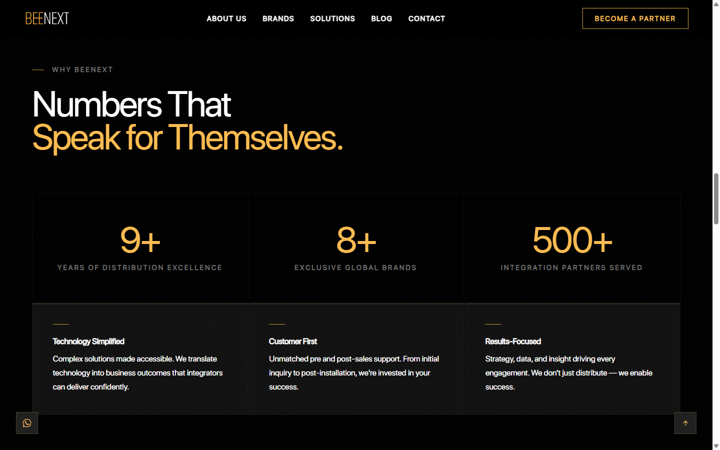
Stats section: 9yr · 8 brands · 500+ partners
Question
"How do I get started?"
Decision
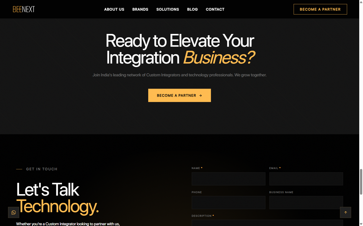
Persistent nav CTA + full-width Partner section
Information Architecture
The homepage follows a deliberate persuasion sequence: introduce → validate → demonstrate → convert. Each section answers the question the CI asks at that scroll depth.
Fixed Nav - always visible - then, in scroll order:
Recognition before reading
Brand marquee sits in section 2, immediately below hero - all 9 brands surface within 1 scroll.
Credibility signals, dedicated
"9 years" and "500+ partners" are the most cited B2B trust signals - a full section (05) is built around them alone.
Re-anchor before the exit
Drop-off is highest at the footer - a full-width Partner CTA (08) re-anchors the value prop right before it.
Low-Fidelity Wireframes
Before any colour or type treatment, wireframes tested layout logic alone: hierarchy, content density, and where each CTA needed to sit. Every panel was checked against one question - does this match the order a CI actually decides in?
Section 01 — Hero
Full viewport · persistent nav with CTA · brand statement above the fold
Trusted Global Brands
Sections 02–03 — Brand Marquee + What We Do
Infinite scroll marquee · 4 capability cards with gold top border
Featured Brands
Section 04 — Featured Brands
Asymmetric bento grid · flagship brands get more visual weight
Why BEENEXT
9+
8
500+
Section 05 — Stats + Why Us
Three large stat numbers · three supporting USPs beneath
Design for Constraints
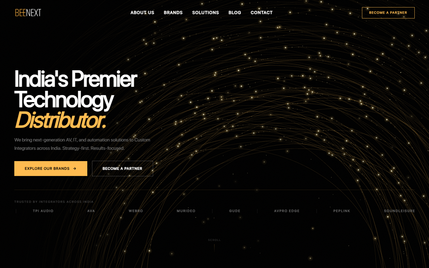
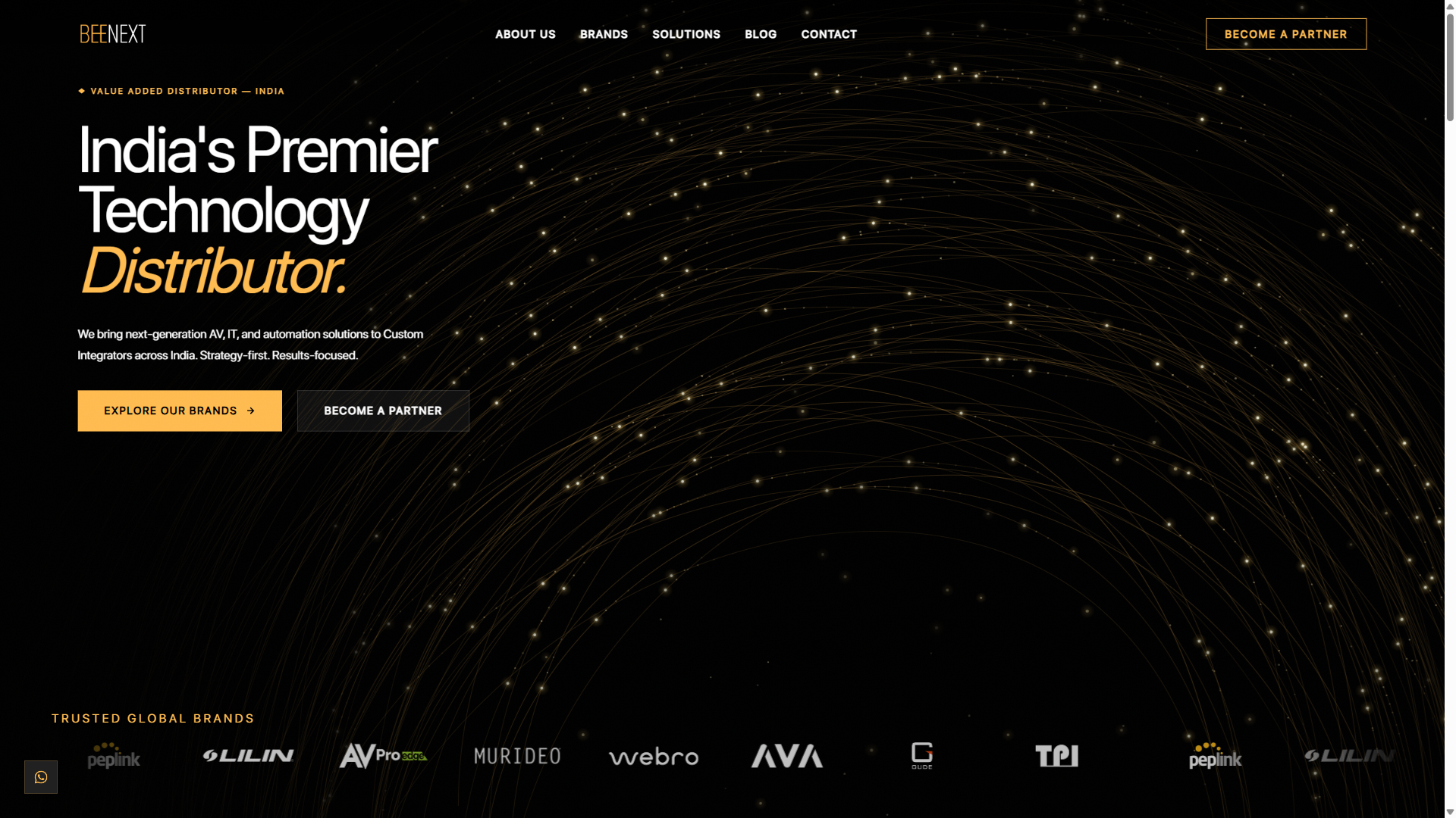
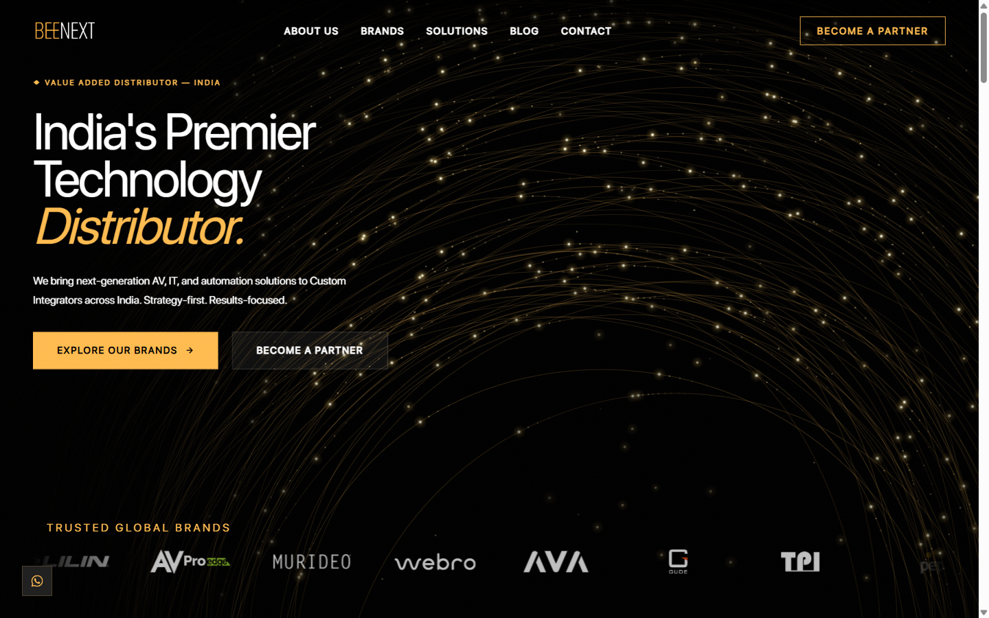
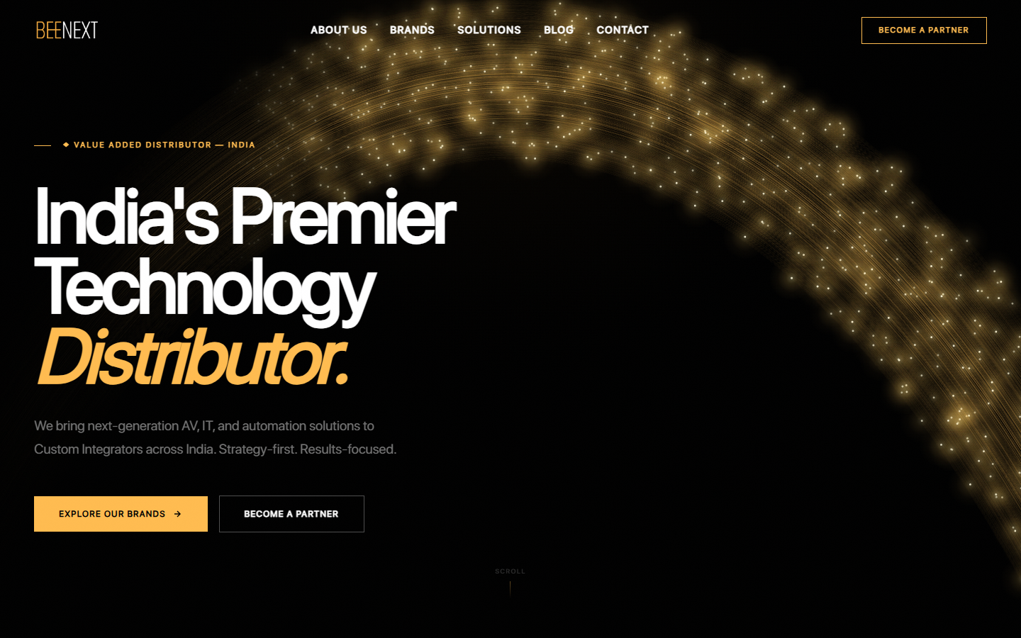
The hero's animated gold particle grid and hexagonal mesh brought the dark canvas to life - but early versions piled on more motion than the headline could carry. The fix wasn't cutting the motion, it was treating animation like typography: does this earn its place?
01 — Initial Load
02 — Mid Iteration
03 — Final Shipped
Animation Audit
Early motion competed with the words instead of supporting them. We kept only what reinforced the brand's energy, and added a quieter, reduced-motion version of the same background for visitors who prefer calmer motion.
Restraint, Elsewhere Too
Icons, charts and ornamentation would have been easy to add - but research was clear that what actually convinces a Custom Integrator is the number itself: large, confident, in gold, with nothing competing for attention. The same restraint carried into the marquee's pacing and the tools BEENEXT uses to run the site day to day.
Content Panel · Login
One calm login screen - no dashboard clutter before you're inside.
Content Panel · Structure
Hero content, brand marquee, stats, featured brands, blog posts and contact details, each clearly labelled and collapsed by default.
Content Panel · Built for a Hurry
Whoever updates a phone number on a Friday afternoon can find the field and be done in under a minute.
Outcomes
Brand-First Trust
Marquee under the hero earns trust fastest
Leading with the brand marquee directly under the hero consistently tested as the fastest way to earn a CI's trust.
Numbers Over Adjectives
Plain stats matched how B2B buyers evaluate
Keeping the stats section plain and numbers-first, rather than decorated, matched how B2B buyers actually evaluate credibility.
Always-On CTA
Getting started never needs a scroll
A "Become a Partner" CTA in the persistent navigation meant the answer to "how do I get started" was never more than a click away.
What Worked
Brand marquee straight under the hero · plain, number-first stats · every animation earning its place · a persistent nav CTA
What I'd Revisit
Wider CI testing before launch · watching someone use the content panel live, not after handoff · more time specifically on mobile